You signed in with another tab or window. Reload to refresh your session.You signed out in another tab or window. Reload to refresh your session.You switched accounts on another tab or window. Reload to refresh your session.Dismiss alert
{{ message }}
Repository navigation
fix(mobile): align the one-line Android thread header - #32894
On Android split view, while the composer has the keyboard, the thread header drops to one line, and the muted subtitle (T3 Code · corex) sat about 2dp above the title's baseline. The Row centred the smaller subtitle against the larger title rather than aligning their text.
Expo UI 58's Row only aligns top, center or bottom, with no baseline option. So the compact title is now one Text with the subtitle as a smaller, muted span. Spans in one paragraph share a baseline. A long title still truncates the subtitle first, as before. The 8dp gap is now two spaces at the subtitle's size.
The sidebar icon and the ✦ in the reported title were already aligned. The icon's centre is within 1px of the title's, both in the report and on the device. The ✦ is a character of the title text itself, so it already shares the title's line. Neither changed.
Scope and approval
A focused fix for an obvious visual bug, reported by a maintainer, under the focused bug-fix exception. It changes one file and only the compact header's text layout; no new behavior or settings.
Verified on a POCO M3 Pro (Android 13) with Smallest width set to 800dp and dev client 2.2.0 (fingerprint fe047aa3). Before is main at dff0b1159b, after is 3f9840959d. Same steps both times: open a thread, focus the composer, capture the header. On the device, the subtitle's text bottom moved from y=141 to y=144, the title's baseline.
Before (top) and after (bottom), 2× crop, red line is the title baseline:
Zoomed: the subtitle sits above the baseline before and on it after:
After, with a long title: the subtitle is cut off first and stays on the same baseline:
vp run check:changed passes.
Not shown: a title containing ✦ on a device (the test data had none), larger tablets, and non-default font sizes.
Implemented by Claude Opus 5.5 in T3 Code (Claude Code harness).
Macroscope's review found this PR approvable — This aligns compact Android header titles and subtitles on a shared baseline while retaining single-line truncation. The change is presentation-only, with reported before/after device verification and no changes to navigation or data handling.
You can add or adjust custom eligibility rules. Learn more.
No actionable comments were generated in the recent review.
Walkthrough
In compact mode, AndroidScreenHeader now renders the title and subtitle as nested text in one paragraph. The change removes the Row layout and weight modifier previously used for the subtitle.
Changes: Android header typography
Layer / File(s)
Summary
Render compact header text apps/mobile/src/components/ui/AndroidScreenHeader.android.tsx
Compact mode renders the subtitle inside the title paragraph, using the title’s color context and a scaled font size. The implementation removes the Row layout and weight modifier.
In a narrow compact header, a title may lose trailing characters when a subtitle is present. The change is mergeable with this limitation.
Pre-merge checks: 4
Check name
Status
Explanation
Title check
The title clearly summarizes the main change: aligning the compact Android thread header.
Description check
The description covers the problem, change, scope and approval basis, and verification. It includes before-and-after screenshots and states which cases were not checked.
Linked Issues check
Check skipped because no linked issues were found for this pull request.
Out of Scope Changes check
Check skipped because no linked issues were found for this pull request.
Finishing Touches
Generate unit tests (beta)
Create a new PR
Autofix · Keep fixing CodeRabbit findings and required CI, and resolving merge conflicts
Included review availability: This review used your included allowance. Your plan provides up to 10 included reviews per hour; 8 remain after this review.
The compact header centred a smaller subtitle against the title, so its
baseline sat above the title's. Render both as spans of one Text so they
share a baseline.

Co-Authored-By: Claude Opus 5.5 <noreply@anthropic.com>
Verified on Android emulator (API 35) against a real dev server
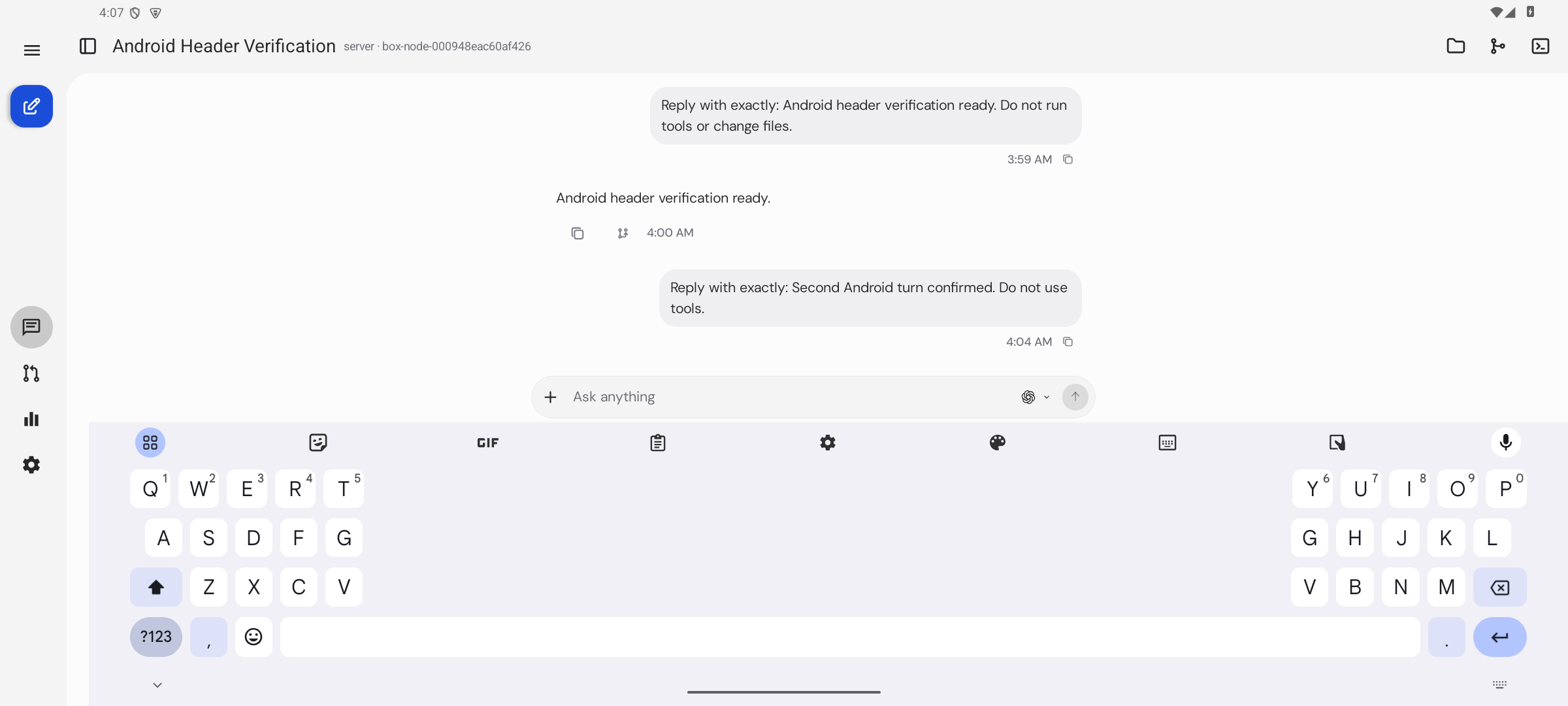
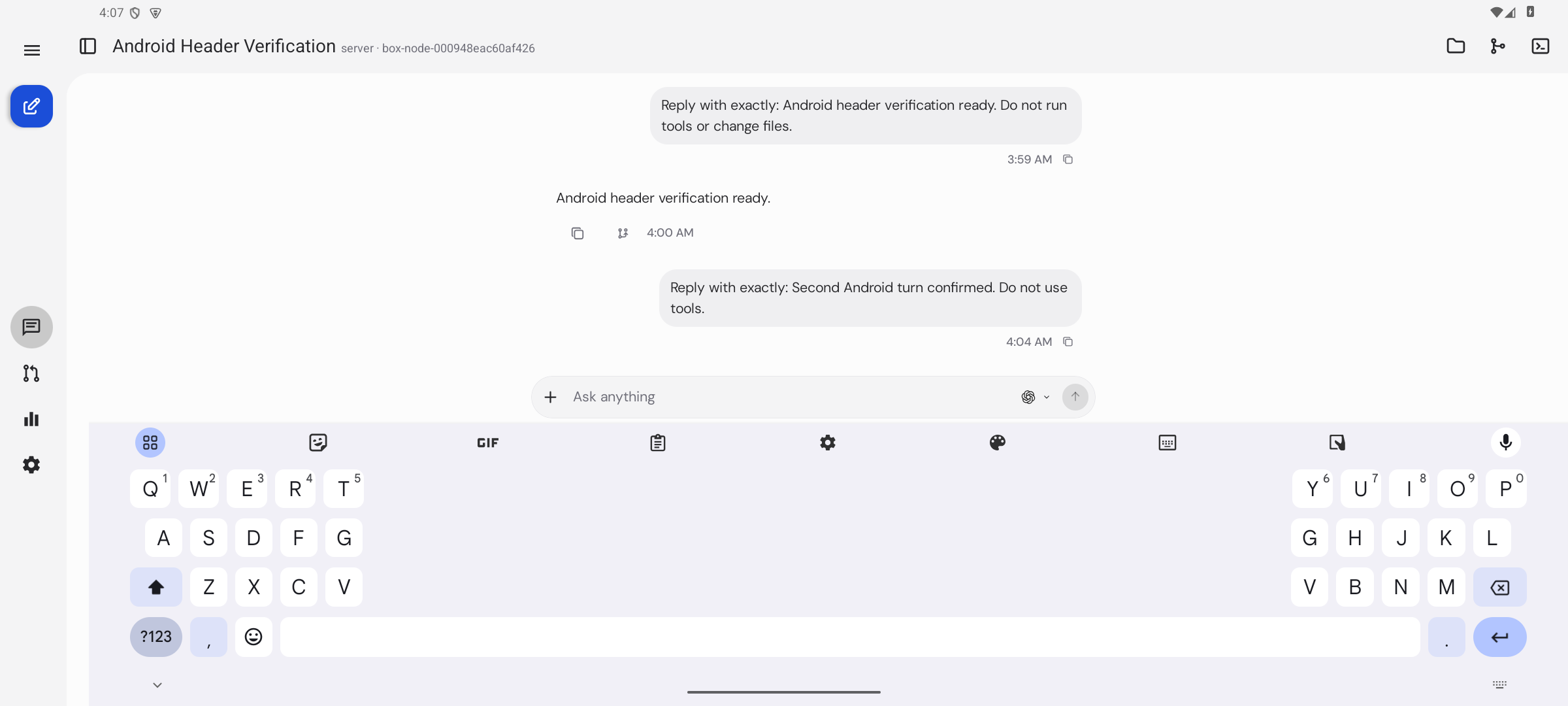
verified head 7c1c2d498dbc3b4b7033b7258aba039f8c1c9842 on the t3 android emulator, using the matching cached native dev client and Metro against an isolated dev server on port 13773. the real server project has two threads. two real Codex gpt-6.1-sol turns completed through the mobile composer, returning "Android header verification ready." and "Second Android turn confirmed."
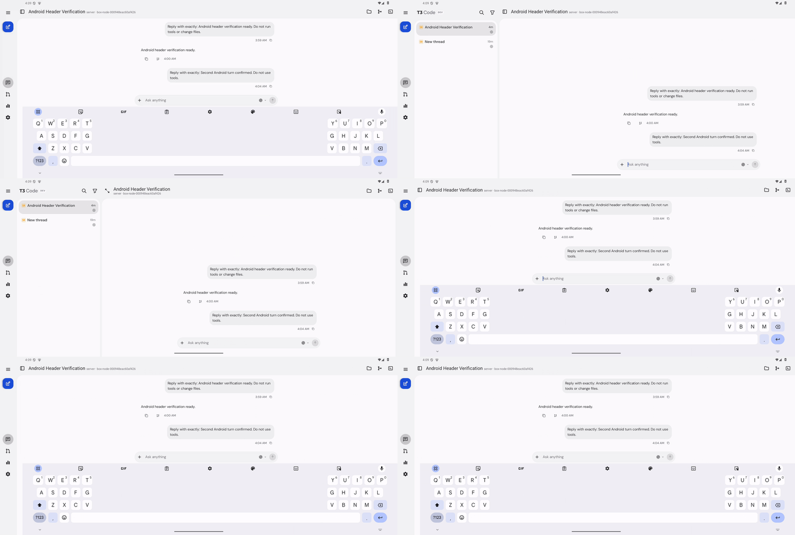
in landscape split view at 216 dpi, focusing the composer opens the keyboard and switches the header to one line. the subtitle shares the title baseline on this head. for the before capture, i temporarily loaded the unchanged parent commit's header component into the same running app with the same thread, then restored the exact PR component. the parent's subtitle sits above the title baseline. this is a component comparison against the parent, not a full github/main run.
dismissing the keyboard restores the two-line header and thread sidebar; focusing again restores the aligned compact header. the files button also opens the real project tree and closes it again. no code changes or pushes were needed. existing head CI checks pass; no new automated checks were run for this verification-only pass.
Not verified
ios cannot run on this linux VM. long-title truncation, a title containing the star character, dark theme, larger font sizes, and other device sizes were not exercised. a full github/main comparison was not run.
Closing: #33599 (9318fdb) removed the one-line compact header this PR realigns. AndroidScreenHeader no longer has that branch and ThreadHeader no longer passes compact, so there is nothing left for this change to apply to.
This file contains hidden or bidirectional Unicode text that may be interpreted or compiled differently than what appears below. To review, open the file in an editor that reveals hidden Unicode characters.
Learn more about bidirectional Unicode characters
size:S10-29 changed lines (additions + deletions).vouch:trustedPR author is trusted by repo permissions or the VOUCHED list.
2 participants
Add this suggestion to a batch that can be applied as a single commit.This suggestion is invalid because no changes were made to the code.Suggestions cannot be applied while the pull request is closed.Suggestions cannot be applied while viewing a subset of changes.Only one suggestion per line can be applied in a batch.Add this suggestion to a batch that can be applied as a single commit.Applying suggestions on deleted lines is not supported.You must change the existing code in this line in order to create a valid suggestion.Outdated suggestions cannot be applied.This suggestion has been applied or marked resolved.Suggestions cannot be applied from pending reviews.Suggestions cannot be applied on multi-line comments.Suggestions cannot be applied while the pull request is queued to merge.Suggestion cannot be applied right now. Please check back later.


 github-actions
Bot
added
vouch:trusted







On Android split view, while the composer has the keyboard, the thread header drops to one line, and the muted subtitle (
T3 Code · corex) sat about 2dp above the title's baseline. TheRowcentred the smaller subtitle against the larger title rather than aligning their text.Expo UI 58's
Rowonly aligns top, center or bottom, with no baseline option. So the compact title is now oneTextwith the subtitle as a smaller, muted span. Spans in one paragraph share a baseline. A long title still truncates the subtitle first, as before. The 8dp gap is now two spaces at the subtitle's size.The sidebar icon and the ✦ in the reported title were already aligned. The icon's centre is within 1px of the title's, both in the report and on the device. The ✦ is a character of the title text itself, so it already shares the title's line. Neither changed.
Scope and approval
A focused fix for an obvious visual bug, reported by a maintainer, under the focused bug-fix exception. It changes one file and only the compact header's text layout; no new behavior or settings.
Verified on a POCO M3 Pro (Android 13) with Smallest width set to 800dp and dev client 2.2.0 (fingerprint
fe047aa3). Before is main atdff0b1159b, after is3f9840959d. Same steps both times: open a thread, focus the composer, capture the header. On the device, the subtitle's text bottom moved from y=141 to y=144, the title's baseline.Before (top) and after (bottom), 2× crop, red line is the title baseline:
Zoomed: the subtitle sits above the baseline before and on it after:
After, with a long title: the subtitle is cut off first and stays on the same baseline:
vp run check:changedpasses.Not shown: a title containing ✦ on a device (the test data had none), larger tablets, and non-default font sizes.
Implemented by Claude Opus 5.5 in T3 Code (Claude Code harness).
🤖 Generated with Claude Code