You signed in with another tab or window. Reload to refresh your session.You signed out in another tab or window. Reload to refresh your session.You switched accounts on another tab or window. Reload to refresh your session.Dismiss alert
{{ message }}
Repository navigation
fix(mobile): Android menus use the theme's card color and rounded corners - #28034
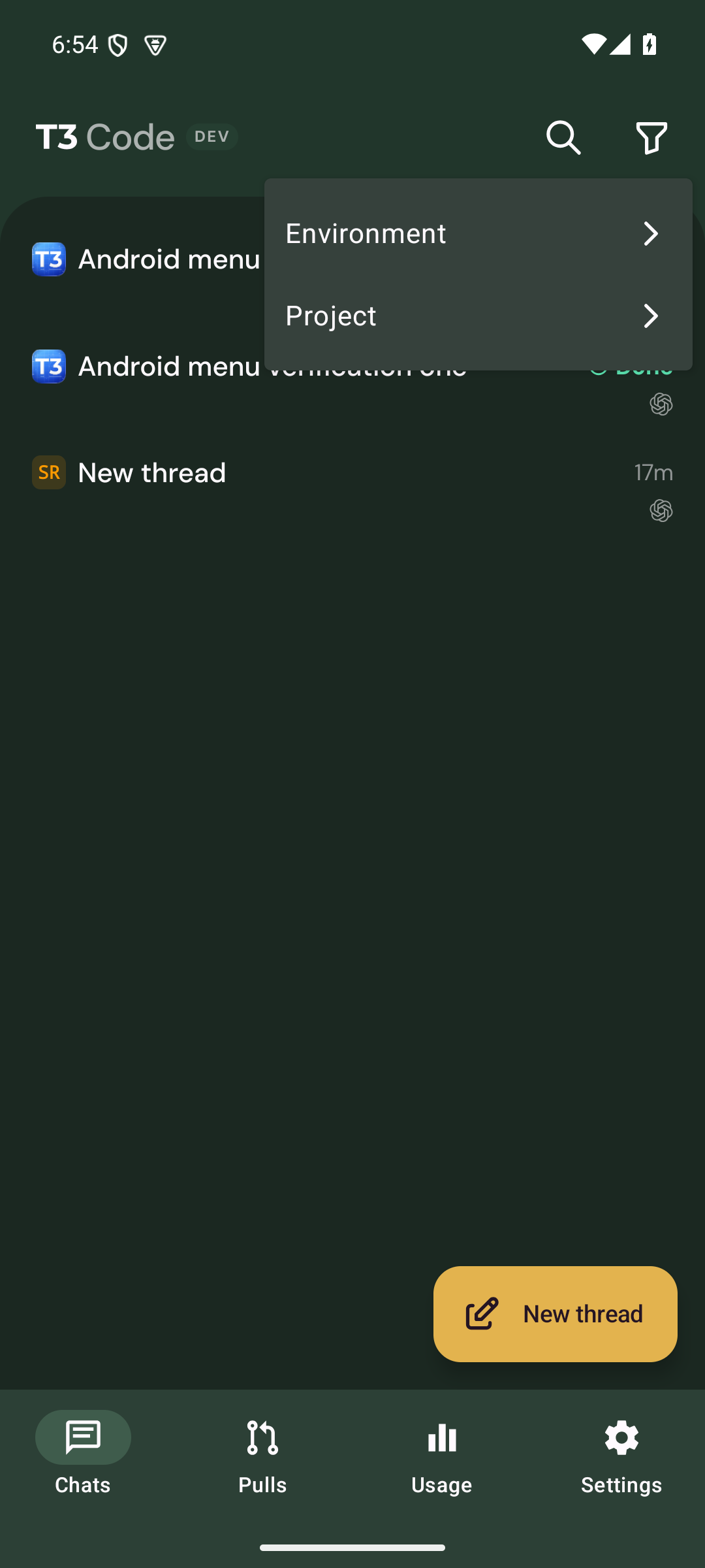
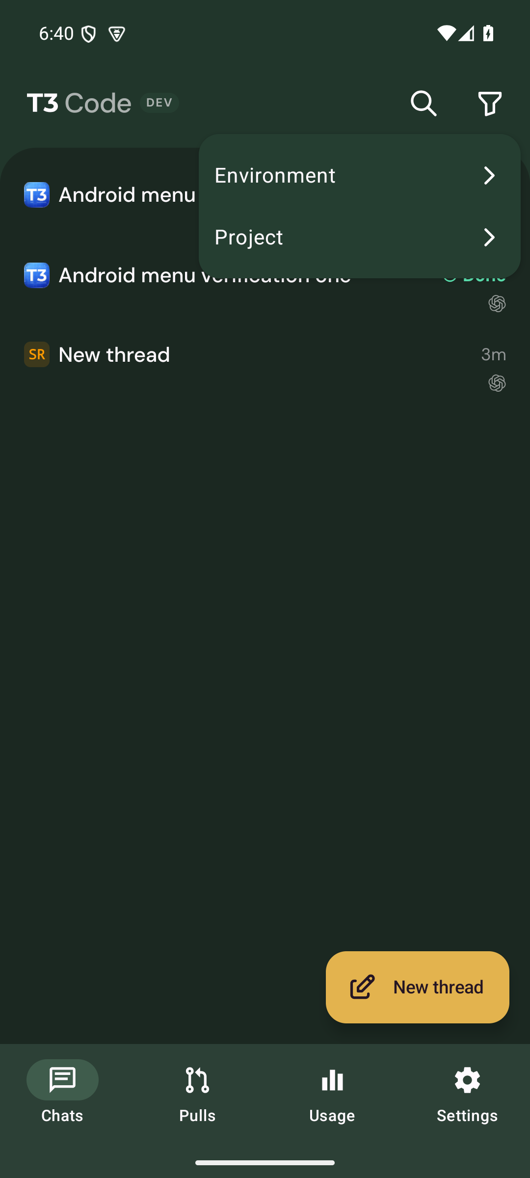
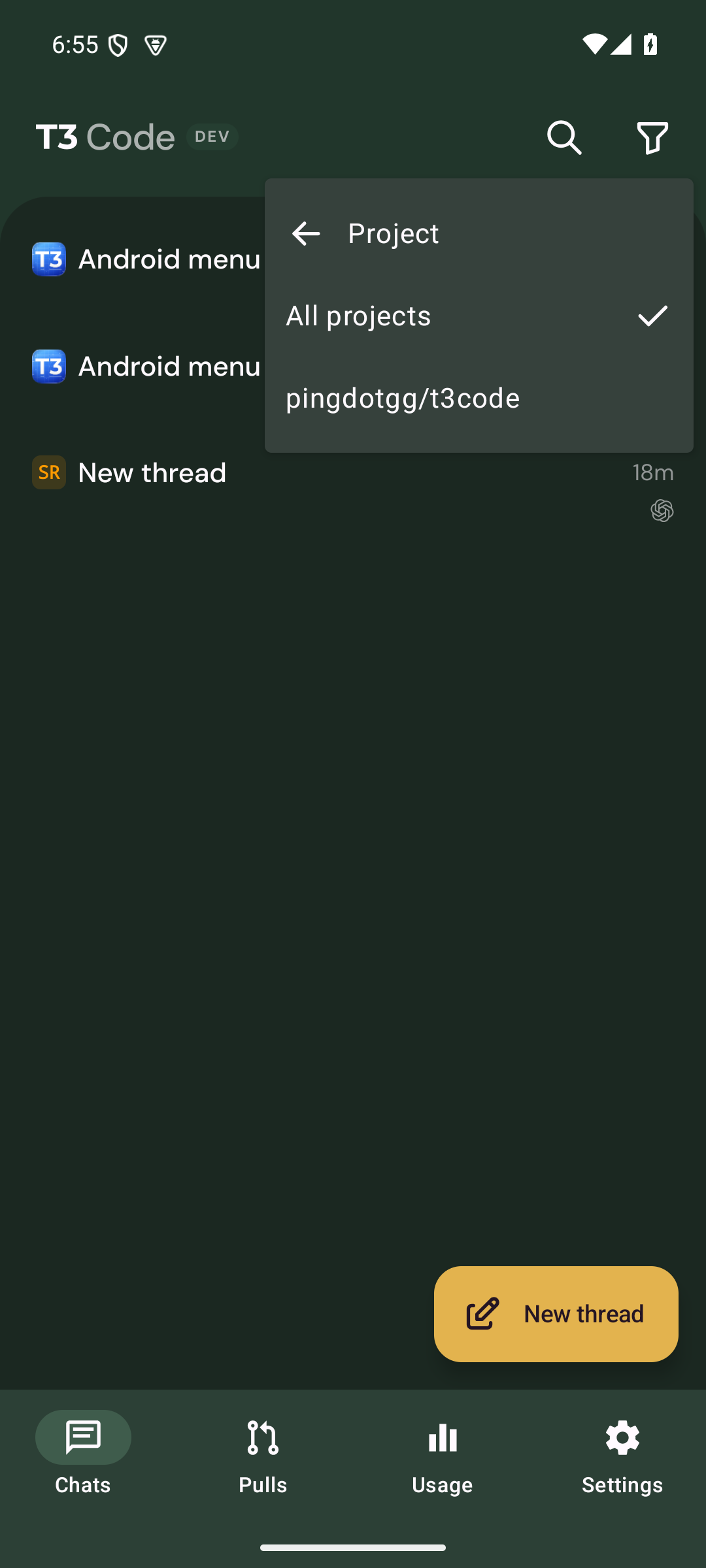
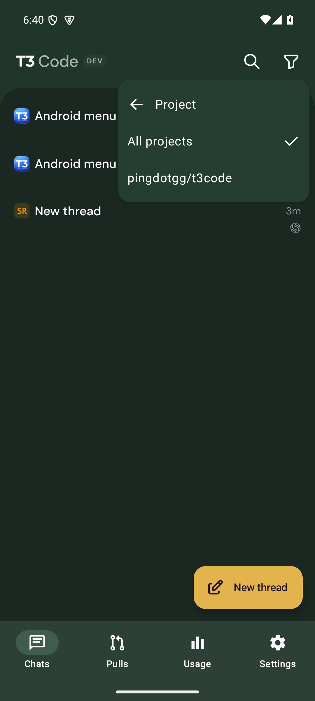
Android dropdown menus (the thread filter and other anchored menus) draw on the theme's raised surface with Material's default 4dp corners. Several themes keep that surface nearly neutral, so in Grove dark the menu renders gray over a green screen. Its square corners also don't match the rounded cards and popovers used everywhere else in the app.
Change
Menus use --color-grouped-card, the theme-tinted card color already used by settings rows, so they follow the active theme. Material You still maps it to its own surface container.
Menus use a 16dp corner radius that scales with text size. This matches the composer's floating command popover. The value is added to androidControlSizing and applied to both the Compose DropdownMenu (cornerRadius) and the inline keyboard-visible variant.
3 files, +11/−4. Android only. iOS uses the native menu and is unchanged.
Scope and approval
This is a small visual consistency fix: menus should use the app's theme colors and corner radius instead of Material defaults. It doesn't change any behavior, entries or workflow. It's also proposed in Ideas discussion #27985, together with a separate project-logo change that I'm holding until it's approved. Related: #14219 (Android looking inconsistent with the rest of the app).
Verification
Tested on an Android emulator (API 35) with a dev client and the showcase demo environments, comparing upstream 80a2351 to this branch:
Grove dark: the menu was gray and now uses the green-tinted card. Corners are rounded.
Ocean dark: the menu now uses the blue-tinted card.
Root menu and Project submenu both checked. Selecting items still works.
Before
After
Grove, Project submenu
Ocean, filter menu
Not checked: light themes, Material You dynamic color on a physical device, and the inline keyboard-visible variant (same token and radius, so the change is identical by code).
Macroscope's review found this PR requires human approval — Android menus switch to the theme’s grouped-card color and scaled 16dp rounded corners. This is a low-risk visual change, but a human must confirm the new default appearance.
You can add or adjust custom eligibility rules. Learn more.
No actionable comments were generated in the recent review.
Walkthrough
Android menu sizing now provides a shared scaled corner radius. Both Android menu components use that radius and the grouped-card color.
Changes: Android menu styling
Layer / File(s)
Summary
Add shared menu corner radius apps/mobile/src/lib/androidControlSizing.ts
resolveAndroidControlSizing now returns a menu corner radius calculated by rounding 16 * scale.
Apply shared menu styling apps/mobile/src/components/ui/AndroidAnchoredMenu.android.tsx, apps/mobile/src/components/ui/MenuPopup.android.tsx
Both menu components use the shared radius and grouped-card color. AndroidAnchoredMenu replaces its 4 * scale radius, and MenuPopup replaces its card-alt color.
Android menus gain themed surfaces and rounded corners. No merge-blocking issue was identified.
Pre-merge checks: 4
Check name
Status
Explanation
Title check
The title clearly summarizes the Android menu color and corner-radius changes.
Description check
The description includes the required Problem, Change, Scope and approval, and Verification sections. It explains the visual issue and fix, states the scope rationale, and reports specific test result…
Linked Issues check
Check skipped because no linked issues were found for this pull request.
Out of Scope Changes check
Check skipped because no linked issues were found for this pull request.
Full details: Description check
Explanation
The description includes the required Problem, Change, Scope and approval, and Verification sections. It explains the visual issue and fix, states the scope rationale, and reports specific test results, screenshots, and unverified cases.
Finishing Touches
Generate unit tests (beta)
Create a new PR
Autofix · Keep fixing CodeRabbit findings and required CI, and resolving merge conflicts
Included review availability: This review used your included allowance. Your plan provides up to 10 included reviews per hour; 9 remain after this review.
Merged current main into the branch with a merge commit (dd47e6b548) to clear the conflict. Git followed main's rename of AndroidAnchoredMenu.tsx to AndroidAnchoredMenu.android.tsx; no manual resolution and no source changes. vp run check:changed passed on the merged head, and all 31 CI checks are green. No actionable bot findings. The Android emulator evidence below was captured on an earlier head and was not re-run after the merge.
Verified on Android emulator (API 35) against a real dev server
Verified head 2c0e73b03226c01840b6bf33c832297dfafda508 on the t3 Android API 35 emulator with the cached native development client, Metro, and an isolated vp run dev server. Created a real project and two real Codex gpt-6.1-sol turns through the server using the local proxy. Both completed, and I opened the second reply in the Android client. No mocks or showcase data were used.
Reproduced the gray surface and small corners on github/main (15fe2832727893cbdd2214383f9f971474849695). With the same project and threads on this head, Grove dark uses a green card surface and rounded corners in the root filter menu and Project submenu. Project selection, the selected checkmark, clearing back to All projects, submenu navigation, and dismissal worked.
Also exercised the inline menu with Gboard visible: both rows and the Project submenu render, selection works on the first tap, and the keyboard stays open. One initial opening showed only the first row; after reopening the app and waiting for the keyboard to settle, both rows rendered. I could not establish that transient result as a PR regression.
No source changes were needed. Existing CI reports 29 successful checks; no new checks were run for this verification-only pass.
Before, root menu on main:
After, root menu on the PR:
Before, Project submenu on main:
After, Project submenu on the PR:
Before, keyboard-visible menu on main:
After, keyboard-visible menu on the PR:
Interaction recording, inspected and playback/seek checked after upload:
Not verified
iOS cannot run on this Linux VM.
Other themes, text-size scaling, physical-device Material You dynamic colors, desktop, and web.
The transient first-row-only inline opening described above remains unexplained. Two emulator crashes during the main comparison reported hung QEMU CPU threads; restarting with two virtual cores allowed the comparison to finish.
…ners

Android dropdown menus drew on the theme's raised surface with Material's
4dp corners. Several themes keep that surface nearly neutral (Grove dark
renders gray over a green screen), so menus looked detached from the app.

Menus now use the grouped-card color shared by settings rows, and the same
16dp radius as the composer's floating command popover, scaled with text size.

Co-Authored-By: Claude Opus 5.5 <noreply@anthropic.com>
This file contains hidden or bidirectional Unicode text that may be interpreted or compiled differently than what appears below. To review, open the file in an editor that reveals hidden Unicode characters.
Learn more about bidirectional Unicode characters
size:S10-29 changed lines (additions + deletions).vouch:unvouchedPR author is not yet trusted in the VOUCHED list.
2 participants
Add this suggestion to a batch that can be applied as a single commit.This suggestion is invalid because no changes were made to the code.Suggestions cannot be applied while the pull request is closed.Suggestions cannot be applied while viewing a subset of changes.Only one suggestion per line can be applied in a batch.Add this suggestion to a batch that can be applied as a single commit.Applying suggestions on deleted lines is not supported.You must change the existing code in this line in order to create a valid suggestion.Outdated suggestions cannot be applied.This suggestion has been applied or marked resolved.Suggestions cannot be applied from pending reviews.Suggestions cannot be applied on multi-line comments.Suggestions cannot be applied while the pull request is queued to merge.Suggestion cannot be applied right now. Please check back later.


 github-actions
Bot
added
vouch:unvouched





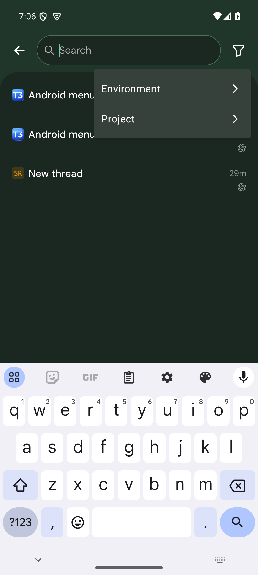
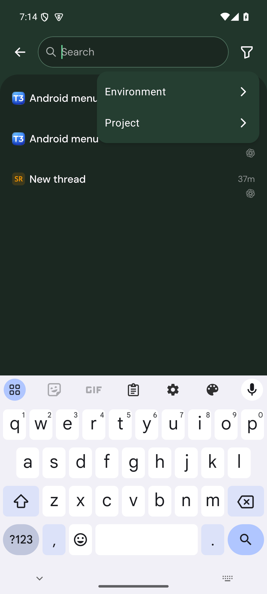


Problem
Android dropdown menus (the thread filter and other anchored menus) draw on the theme's raised surface with Material's default 4dp corners. Several themes keep that surface nearly neutral, so in Grove dark the menu renders gray over a green screen. Its square corners also don't match the rounded cards and popovers used everywhere else in the app.
Change
--color-grouped-card, the theme-tinted card color already used by settings rows, so they follow the active theme. Material You still maps it to its own surface container.androidControlSizingand applied to both the ComposeDropdownMenu(cornerRadius) and the inline keyboard-visible variant.3 files, +11/−4. Android only. iOS uses the native menu and is unchanged.
Scope and approval
This is a small visual consistency fix: menus should use the app's theme colors and corner radius instead of Material defaults. It doesn't change any behavior, entries or workflow. It's also proposed in Ideas discussion #27985, together with a separate project-logo change that I'm holding until it's approved. Related: #14219 (Android looking inconsistent with the rest of the app).
Verification
Tested on an Android emulator (API 35) with a dev client and the showcase demo environments, comparing upstream
80a2351to this branch:Not checked: light themes, Material You dynamic color on a physical device, and the inline keyboard-visible variant (same token and radius, so the change is identical by code).
Done with Claude Opus 5.5 in Claude Code.
🤖 Generated with Claude Code