Repository navigation
Conversation


 github-actions
Bot
added
vouch:unvouched


Walkthrough
Merge Risk:
 |


| Check name | Status | Explanation |
|---|---|---|
| Title check |  |
The title names the mobile scope and the main fix: compose buttons on Android should scale with text size. The changeset replaces the Compose graphicsLayer scale with a React Native wrapper transform … |
| Description check | |
The description follows the template's main sections: Problem, Change, Scope and approval, and Verification. The Problem and Change sections clearly explain the defect and the fix. The Scope section g… |
| Linked Issues check | |
Check skipped because no linked issues were found for this pull request. |
| Out of Scope Changes check | |
Check skipped because no linked issues were found for this pull request. |
Full details: Title check
-
Explanation
The title names the mobile scope and the main fix: compose buttons on Android should scale with text size. The changeset replaces the Compose graphicsLayer scale with a React Native wrapper transform in ScrollComposeButton.android.tsx, which matches the title's subject. The title is short, specific, and follows conventional commit style.
Full details: Description check
-
Explanation
The description follows the template's main sections: Problem, Change, Scope and approval, and Verification. The Problem and Change sections clearly explain the defect and the fix. The Scope section gives a justification for a small obvious bug fix without a prior issue, as the template allows. The Verification section gives specific before/after evidence at 11pt, 16pt, and 22pt, tap checks, a changed-file check, and a focused test run. The template's optional agent attribution line is present. Minor gaps: the Scope section does not link a triaged issue or discussion, and the template's required comment about the scope qualifying for the obvious-bug exemption is only partly covered. The image links are embedded in the author's text and are not visible in this review, so they cannot be checked here.
Finishing Touches
-
🧪 Generate unit tests (beta)
-
- Create a new PR
-
- Autofix · Keep fixing CodeRabbit findings and required CI, and resolving merge conflicts
Usage-based review receipt
- Mode: Continue automatically
- Reviewed files: 1
- Charged: $0.25
- View usage details
Note
This review was completed with usage-based billing: files reviewed beyond your plan's included limits are billed at $0.25/file. View usage-based billing.
Comment @coderabbitai help to get the list of available commands.


|
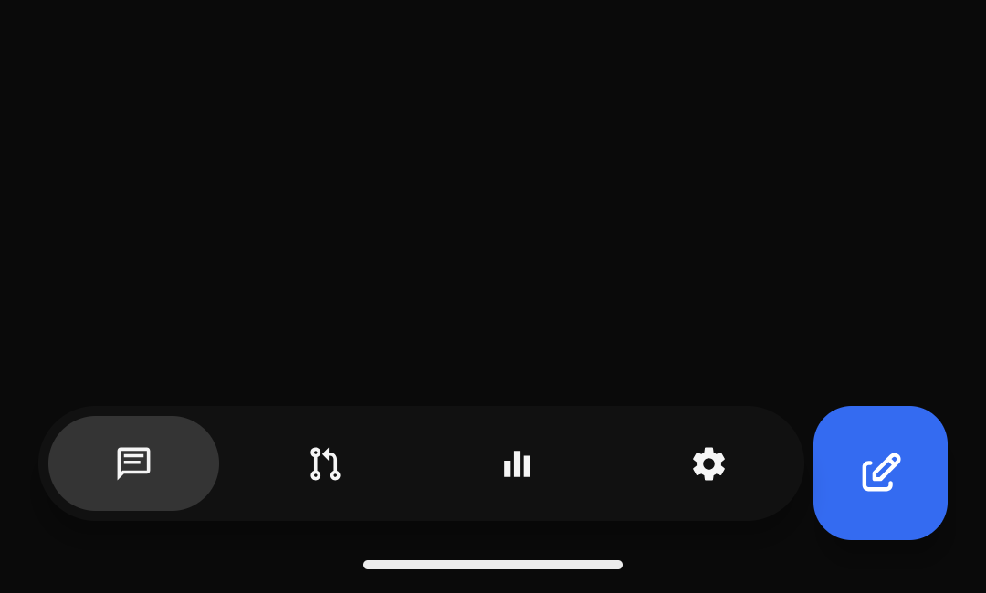
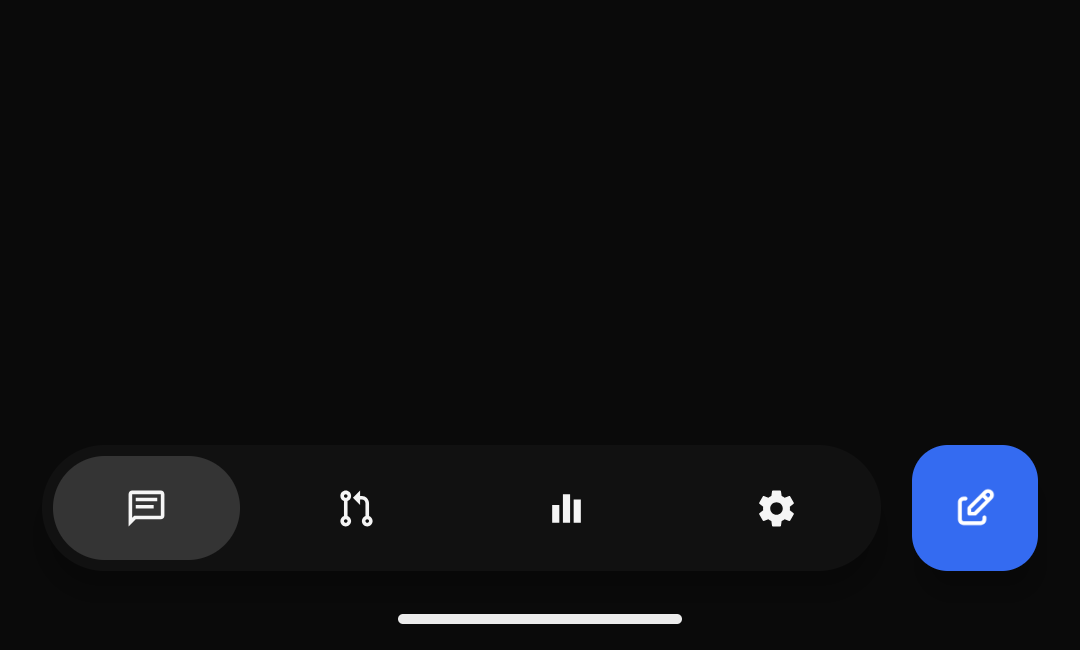
Note Written by thanks @none23. moving the existing scale to the react native visual wrapper is the focused fix this needs. i kept your commits and implementation, merged current main without rebasing, and added one correction: scale from the top-left in rtl, matching compose's mirrored alignment and the existing touch target. the final diff is one file, 9 additions and 9 deletions. no controls, actions, or accessibility behavior were repurposed. verification at
these are your original 11 pt one ui captures, inspected and re-uploaded for review. they demonstrate the original ltr change, not a fresh run on this head or rtl coverage. your other captures remain in the pr description. |
|
Note Written by Verified in a real dev environmentNo changed behavior could be exercised on this Linux VM. This is an unverifiable run, not a runtime pass. I inspected the current diff, description, discussion, commit authors, and check status at The diff only changes Environment probe: Not verifiedMain reproduction, PR native rendering, before/after captures, and real Codex gpt-6.1-sol turns through the Android client remain unverified. There was no usable Android device; the repository mobile verification skill requires stopping when device access is unavailable. I did not start a dev server, install dependencies, modify code, or substitute web output or the author's screenshots for fresh proof. No new evidence images or recordings were captured. A follow-up needs an automation-enabled Android device with the real dev client: compare matching data at 11pt, 16pt, and 22pt for both navigation styles on main and this exact head; check LTR and RTL alignment, expanded/collapsed New thread taps, adjacent tab/list touch targets, and creation of a thread with a real Codex gpt-6.1-sol turn. iOS and desktop were not exercised and do not execute the changed Android component. |


Problem
At smaller Android text sizes, the compose button stays at its native 56dp minimum while One UI's floating navigation shrinks to 48dp. The same ignored scale also leaves Material's expandable button, icon, and label oversized.
Change
Apply the existing scale to the React Native visual wrapper instead of Expo's ineffective
graphicsLayermodifier. Both navigation styles retain the shared font-scaled size, top-right alignment, and separate touch target. Default and larger text sizes are unchanged.Scope and approval
Small, focused fix for an existing visual defect in one shared Android component: five lines added and eight removed. It qualifies as an obvious bug fix without a prior issue. Both One UI and Material callers are covered.
Verification
vp run check:changedpasses on the rebased head. Two pre-existing looping.envsymlinks were temporarily excluded and restored for the check.vp test run apps/mobile/src/features/workspace/floating-workspace-tabs.test.ts: 12 tests pass.All images below are navigation crops from actual emulator captures at the same viewport and setting within each pair.
One UI
Material
Implemented with gpt-6-astra through Codex. Reviewed by Claude Opus 5.5 through T3 Code's Claude provider.